Quick Answer:
A KPI dashboard works when the data behind it is consistent. Define KPI ownership, align source definitions in your CRM, analytics platform and ad channels, and establish reporting logic before building any visualization layer. Dashboards built on conflicting data sources produce reports that leadership stops trusting.
TL;DR
- Align KPI definitions in CRM, GA4 and ad platforms before building any dashboard.
- Assign ownership for each metric and define how revenue is counted in each system.
- Choose the dashboard type based on the decision it needs to support: operational, strategic or analytical.
- Automate data updates and review reporting logic annually as your stack evolves.
- Remove metrics that do not connect to a decision. Reporting volume without governance creates noise, not clarity.
- A dashboard that updates before governance is in place only distributes unreliable data faster.
Your finance team reports one revenue number. Your CRM shows another. Your marketing dashboard shows a third. Leadership asks which one to use for the budget decision, and the room goes quiet.
This is a measurement infrastructure problem. AI automation has accelerated reporting cycles while CRM, analytics and ad platforms increasingly diverge in how they count the same events. The result is a dashboard layer that visualizes disagreement faster than any team can investigate it.
This guide covers how to build KPI dashboards that leadership can trust because the measurement system behind them is reliable. The focus is on reporting consistency, KPI governance and the source alignment that determines whether dashboard data is worth acting on.
What Has to Be True Before a KPI Dashboard Can Be Trusted?
In Darwin Flux, a KPI dashboard belongs near the end of the measurement sequence, after tracking, integrations and source definitions are reliable. That stage is called Clarity: where KPI definitions, reporting logic and source-of-truth decisions get made. It functions only when the stages below it are stable.
Surface is where behavior starts: website events, landing page conversions, form submissions and campaign click actions. When Surface tracking fires inconsistently or maps events differently between pages, the data entering the reporting chain is already compromised.
Connections is where that signal travels: through GTM, GA4, server-side tagging, CRM stages and ad platform integrations. When GA4 and your CRM use different attribution windows, or when paid platforms apply different conversion definitions, the same customer journey produces different numbers in each system.
Trusted reporting sits on top of both. A dashboard built without reliable behavioral data and consistent Connections will display confident numbers from incompatible sources. Visualization cannot fix what the measurement chain does not resolve.
Momentum, which covers forecasting, automation and AI-driven decisions, becomes possible only after source alignment exists. Organizations that automate reporting before source definitions are resolved distribute inconsistent data faster. Decision quality stays unchanged.
What Is a KPI Dashboard and Why Do Leadership Teams Stop Trusting Them?
A KPI dashboard displays an organization's critical metrics in one location. It connects data from multiple sources and presents the results through visualizations that update on a defined schedule.
The failure mode is rarely the visualization. Source-of-truth conflict is the more common culprit. When finance, marketing and CRM systems use different definitions for the same metric, the dashboard reflects those conflicts accurately. Leadership sees inconsistent numbers, starts building manual slide decks from individual system exports, and the dashboard becomes a reporting artifact. Decision-making moves elsewhere.
"Dashboards should answer questions, not just display data. The best ones act like decision co-pilots." — Mico Yuk, BI Evangelist & Founder of BI Brainz
What Does a KPI Dashboard Do?
A KPI dashboard turns data from multiple systems into a shared reporting view. Its value depends entirely on whether the underlying data uses consistent definitions, consistent attribution logic and consistent time-period boundaries in all connected sources.
A dashboard that aggregates inconsistent inputs will display confident-looking numbers built on conflicting logic. The visualization layer cannot fix what the data layer does not resolve.
How Is a KPI Dashboard Different from a Report?
Dashboards monitor ongoing results and update continuously. Reports compile historical data over defined periods and provide structured analysis of past outcomes.
The governance implication is significant. A dashboard that updates on a short schedule will surface data conflicts faster than a monthly report. Scheduled updates accelerate the distribution of bad data when reporting logic differs between systems.
Why Do Scheduled Dashboard Updates Require Stronger Reporting Governance?
Faster data refresh gives teams earlier insight into changes in results. It also propagates definition mismatches and attribution conflicts at the same speed.
A sudden drop in a revenue metric might reflect a real problem or a CRM field mapping that changed. A spike in attributed conversions might reflect campaign outcomes or a tag that fired incorrectly. Without documented KPI definitions and ownership, teams spend reporting cycles investigating discrepancies. Decisions wait.
"Real-time updates turn dashboards into operational control centers. It is the difference between managing and guessing." — Tamara Dull, Thought Leader in Data Governance
How to Build a KPI Dashboard That Leadership Can Act On
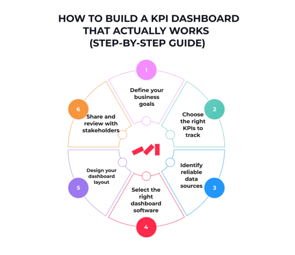
Building a dashboard that drives decisions requires resolving the reporting infrastructure questions before selecting a visualization tool. The sequence matters.
1. Define the Decision the Dashboard Must Support
Start with the decision. The metric follows from it. Each dashboard should answer a specific operational question: which channels are contributing to pipeline, where conversion rates are dropping, or whether customer acquisition costs are moving within acceptable range.
A dashboard without a defined decision context accumulates metrics over time until no single number is acted on. Align stakeholders from finance, marketing and operations on what each team needs to see and what action each metric is supposed to trigger.
2. Choose KPIs That Connect Directly to That Decision
After goals are defined, select KPIs that connect directly to those outcomes. Revenue growth requires tracking average order value and pipeline velocity. Marketing efficiency requires customer acquisition cost and payback period.
Limit each dashboard to five to ten metrics. Reporting on more metrics than a team can act on shifts attention from decision-making to report maintenance. The MAD framework provides a useful structure: a monitor level for high-level KPIs, an analysis level for cross-department investigation, and a drill level for detailed source-level exploration.
"Limit your KPIs. Clarity beats quantity. A dashboard should help people act, not guess." — Bernard Marr, Author, Data Strategy
3. Establish Source of Truth Before Connecting Any Data
Every data source connected to a dashboard introduces a definition question. Does your CRM count a deal as closed when the contract is signed or when the payment clears? Does your analytics platform attribute a conversion to the last paid click or the first organic visit? Do your ad platforms use the same attribution window as your CRM?
Before connecting any source, document the following:
- Define the source of truth for every KPI and record which system owns each number.
- Document where each KPI is calculated and which field or event triggers the count.
- Confirm whether GA4, CRM and paid platforms use the same campaign, lead and revenue definitions.
- Resolve attribution window conflicts between ad platforms and CRM before building any joined view.
- Establish escalation paths for when numbers diverge so teams go directly to the source system, not the dashboard display.
Inconsistent definitions produce dashboards that show accurate numbers from each system and contradictory conclusions in the combined view. No visualization tool resolves a definition conflict that exists at the source level.
4. Select Dashboard Software After Source Alignment Is Done
Platform selection follows source alignment. Evaluate tools based on their integration depth with your existing stack, their support for the attribution logic your team has defined, and their ability to flag data quality issues when source definitions drift.
Key criteria: native connectors to your data warehouse or CRM, flexible visualization options, team-level permission controls, and scheduled data refresh aligned with your reporting cadence.
5. Design for the Audience First
Place the metrics that drive the most frequent decisions in the top-left position where attention lands first. Group related metrics together so teams can read context without switching between views.
Visualization choices should follow the data type. Line charts work for trends over time. Bar charts work for comparisons between categories. Scorecards work for single KPI status against a target. Avoid decorative elements that increase reading time without adding interpretive value.
6. Assign Ownership and Set Review Cadence
Every metric on a dashboard needs an owner: a person or team responsible for the definition, the source and the escalation path when the number looks wrong.
Distribute access with appropriate permissions and document the reporting logic for each KPI so new team members can interpret the data without tribal knowledge. Review the dashboard structure annually or when a material system change affects the underlying sources.
How Do You Know If a KPI Dashboard Is Ready for Leadership Use?
Before a dashboard goes into active use, run a source reconciliation check. Dashboards that pass visualization review but fail this check will lose credibility within the first reporting cycle.
Check the following before the dashboard goes live:
- Does revenue in CRM match finance reporting closely enough for leadership to use the same number?
- Do MQL, SQL, opportunity and customer definitions match in marketing, sales and finance?
- Are UTMs and campaign IDs preserved end-to-end from ad click through CRM closed-won?
- Are form submissions, demo requests and conversions deduplicated in all sources?
- Can every executive KPI be traced back to a specific source system and a documented calculation?
- When the same metric appears in two systems, is the variance explained and within an acceptable range?
A dashboard that cannot pass this check needs more work before going live. Adding it to a leadership reporting cadence before source reconciliation is complete produces the scenario most reporting teams recognize: two hours of an executive review spent investigating why the numbers do not match.
What Type of KPI Dashboard Does Your Team Need?
Dashboard type determines the audience, the update frequency and the level of detail required. Selecting the wrong type for the audience produces a dashboard that collects views without driving action.
When Does a Strategic Dashboard Work and When Does It Fail?
Strategic dashboards give senior leadership a view of company health against long-term objectives. They update weekly or monthly and focus on lagging indicators: revenue growth, market share, churn rate and profitability.
The failure mode for executive dashboards is metric proliferation. When every department adds its priority KPI, the dashboard loses its function as a decision tool and becomes a status report. Executive dashboards work best when limited to the metrics that determine strategic direction and resource allocation.
What Makes an Operational Dashboard Different from a Strategic One?
Operational dashboards track what is happening now. They update on short schedules and focus on leading indicators: order fulfillment rates, support ticket volume, system uptime and campaign spend pacing.
Teams use operational dashboards to identify problems before they escalate. The governance requirement is stricter here because errors surface and spread faster. An operational dashboard with weak source governance distributes data quality problems at the same speed it distributes execution data.
When Should a Team Use an Analytical Dashboard Instead of a Report?
Analytical dashboards support investigation. Monitoring is a separate function handled by operational dashboards. Data analysts, marketing operations teams and revenue operations use analytical dashboards to identify patterns, test hypotheses and understand the relationship between inputs and outcomes.
These dashboards require more filter options, longer data windows and greater flexibility in how metrics are segmented. Their output is insight that feeds strategic or operational decision-making elsewhere.
How Do Tactical Dashboards Connect Strategy to Daily Execution?
Tactical dashboards help mid-level managers track project progress, team output and campaign results against short-term targets.
A marketing team running a demand generation program might track lead volume, cost per lead, pipeline impact and conversion rate by channel. The dashboard answers whether current execution is on track against the plan.
Which KPI Dashboard Setup Works for Each Department in B2B SaaS?
Each department has distinct reporting requirements. The shared governance challenge is ensuring that metrics which appear in multiple dashboards use the same definitions in all of them.
Sales KPI Dashboards: What Metrics Indicate Pipeline Health?
Sales dashboards track pipeline health, deal velocity and rep-level activity. Chief revenue officers rely on views that show results against annual targets alongside deal-level detail for active opportunities.
The attribution conflict that most affects sales dashboards is how pipeline is counted. When marketing and sales use different criteria for what qualifies as a pipeline opportunity, the dashboard numbers will differ depending on which system is queried. Resolving the definition conflict at the CRM level is a prerequisite for consistent sales reporting.
Marketing KPI Dashboards: How to Report Attribution Without Platform Conflicts
Marketing dashboards track campaign results, lead volume, cost metrics and pipeline impact. The challenge in B2B SaaS marketing reporting is multi-touch attribution: a single closed deal involves eight to twelve touchpoints in paid, organic and direct channels.
When ad platforms, CRM and analytics use different attribution models, the same campaign shows different results in each system. A marketing KPI dashboard built without resolving attribution logic produces conflicting channel ROI figures that cannot be reconciled.
Finance KPI Dashboards: Where Revenue Recognition Creates Reporting Gaps
Finance dashboards give CFOs and finance teams a view of revenue growth, gross margin, operating cash flow and EBITDA. The reporting conflict that most affects finance dashboards is revenue recognition timing: when a contract is signed versus when revenue is recognized under the company's accounting policy.
Finance dashboards that pull from CRM data without accounting for recognition timing will overstate or understate revenue relative to what finance reports. Aligning the data pull logic to match the recognition policy is an operational requirement. The visualization layer has no role in that decision.
Operations KPI Dashboards: What Data Freshness Requirements Mean in Practice
Operations dashboards monitor process health, system uptime, fulfillment rates and asset results. They function as early warning systems: small deviations in key metrics signal problems before they affect customers or financial outcomes.
The governance requirement here is data freshness. An operations dashboard with a 24-hour data lag cannot serve its function as a timely monitoring tool. Define the acceptable data latency for each metric before selecting the data refresh architecture.
Executive KPI Dashboards: Why Leadership Stops Trusting the Numbers
Executive dashboards integrate metrics from finance, sales, marketing and operations into a single leadership view. The design challenge is selecting metrics at the right level of aggregation: detailed enough to be meaningful, high-level enough to avoid decision-by-committee on operational details.
Leadership stops trusting executive dashboards when finance, marketing and CRM data diverge on the same underlying business event. The source-of-truth conflict is the most common reason executive dashboards get replaced by manual slide decks built from individual system exports.
KPI Dashboard Best Practices That Go Further Than Design
A dashboard that no one trusts is a reporting cost with no return. The practices below address the governance and design decisions that determine whether a dashboard drives decisions or generates skepticism.
How Many KPIs Should a Dashboard Show?
Five to ten metrics is the functional range for most dashboard types. Each metric should connect directly to a decision or an action threshold.
Define the purpose of each dashboard before selecting metrics. Executives need fast visual summaries. Analysts need filter depth and historical context. Placing both audiences in the same dashboard serves neither well.
How to Choose a Visualization Type for Each Metric
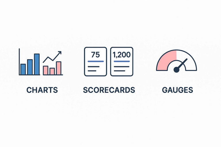
Visualization type should follow the operational question the metric answers. Line charts communicate trends over time. Bar charts communicate relative results between categories. Scorecards communicate status against a defined target.
The data-ink ratio is a useful design principle: every visual element should contribute to interpretation. Decorative elements that require cognitive processing without adding meaning slow down the decision cycle the dashboard is supposed to accelerate.
How to Design KPI Dashboards for Mobile Review
A significant share of business professionals review execution data on mobile devices. Mobile displays require higher contrast, larger type and simplified layouts. KPIs and outliers need to be readable without zooming.
Mobile-first design also reveals whether a dashboard contains too many metrics. A dashboard that cannot communicate its main insight on a phone screen contains more information than the audience can act on.
When Should KPI Dashboard Updates Be Automated?
Manual reporting introduces errors and delays. Automated pipelines that extract, transform and load data on a defined schedule eliminate the formula errors and data gaps that accumulate in spreadsheet-based reporting.
Automation is a multiplier. Automated dashboards free analysts to investigate patterns. Pipeline maintenance moves to scheduled jobs. The prerequisite is that the underlying source definitions and attribution logic are documented and governed. Automation makes inconsistency visible faster. Resolving that inconsistency requires governance. A faster pipeline alone will not do it.
KPI Dashboard Mistakes That Start Before the Dashboard Exists
The most common dashboard failures happen before a single visualization is built. They are infrastructure decisions that produce accurate numbers from incompatible sources.
Building Dashboards Before Fixing Source Data
A dashboard built on unresolved source conflicts will display those conflicts accurately and at scale. Finance sees one revenue number. Marketing sees another. The dashboard becomes the place where the disagreement is visible. Resolving it requires going back to the source.
Resolve source-of-truth conflicts and align KPI definitions in all systems before any dashboard layer is introduced. The visualization is the last step in the sequence.
Mixing Platform-Reported Conversions with CRM Revenue Without Reconciliation
Ad platforms report conversions based on their own attribution models. CRM reports closed revenue based on sales stages. Without a reconciliation layer that maps platform conversions to CRM outcomes, combined dashboards show incompatible metrics as if they measure the same thing.
Define the reconciliation logic before combining sources. Establish which number takes priority for each decision context and document the variance range that is acceptable between systems.
Using KPI Names Without Shared Definitions
Revenue, pipeline, conversion, lead and opportunity mean different things to different teams. When a dashboard uses these terms without documented definitions, each viewer interprets the number through their own system's logic.
Shared KPI definitions, documented in a data dictionary and agreed by finance, sales and marketing, are a prerequisite for any dashboard that crosses departmental boundaries.
Treating Dashboard Software as the Solution
Dashboard tools display data. Switching from one BI platform to another does not resolve attribution conflicts, definition mismatches or tracking gaps in the underlying stack.
Evaluate tooling after the measurement infrastructure questions are answered. The right platform for a team with clean, well-governed data differs from the right platform for a team that is still resolving source conflicts.
Automating Reports Before Source Definitions Are Resolved
Automated reporting at scale without resolved reporting logic produces a high volume of consistently wrong numbers. The team receives dashboards faster. The dashboards reflect the same unresolved disagreements as the manual reports they replaced.
Automation belongs at the Momentum stage of the measurement stack. It requires shared definitions, resolved source conflicts and documented ownership as a precondition. Without those, automation runs faster on a broken foundation.
How Darwin Builds the Measurement Foundation That Makes KPI Dashboards Reliable
The most common reason KPI dashboards lose leadership trust is the reporting logic underneath the visualization. When CRM, analytics and ad platforms count the same business events differently, dashboards produce accurate reports from each system and contradictory conclusions in the combined view.
Darwin works with B2B and enterprise marketing teams to resolve measurement infrastructure before any dashboard layer is introduced. The process starts by reviewing tracking architecture, attribution logic and CRM field mapping. Source conflicts and KPI definition gaps are identified and resolved at the data level. Reporting logic follows from that work.
Engagement scope covers:
- GA4 and analytics warehouse setup with event tracking and channel attribution validation
- CRM and marketing automation configuration aligned to revenue reporting logic
- Paid media pipeline design connecting ad platforms to CRM with consistent attribution windows
- KPI definition governance with documented ownership and escalation paths
When ABC Fitness Solutions approached Darwin with critical Google Analytics configuration issues, the team lacked a reliable view of customer behavior and campaign results. After resolving tracking gaps and integrating third-party tools, user engagement increased 24% and campaign effectiveness improved 15% within six months.
That is the foundation a dashboard needs before leadership can trust it. Darwin builds that foundation before the visualization layer is added.
FAQs
Q1. What is a KPI dashboard and why is it important?
A KPI dashboard displays an organization's critical metrics in one centralized view. It is important because it connects data from multiple systems and provides the reporting consistency that leadership needs to make decisions with confidence. A dashboard built on misaligned source definitions produces conflicting numbers that undermine decision-making.
Q2. How many KPIs should be included in a dashboard?
Five to ten metrics is the functional range for most dashboard types. Each metric should connect directly to a decision or an action threshold. Metrics without a defined owner or a clear action attached to them belong in an exploration view, not in an operational dashboard.
Q3. What are the different types of KPI dashboards?
There are four main types: strategic dashboards for long-term results against company objectives, operational dashboards for daily monitoring of leading indicators, analytical dashboards for pattern investigation and hypothesis testing, and tactical dashboards for short-term project and campaign tracking. Each type serves a different audience and requires a different governance structure.
Q4. How often should KPI dashboards be updated?
Operational dashboards should update on a short, defined schedule. Strategic dashboards update weekly or monthly. All dashboards should have their underlying reporting logic reviewed at least annually and whenever a material system change affects a connected data source. Automation handles data refresh. Governance handles logic accuracy.
Q5. What are the most common mistakes when building a KPI dashboard?
The most common failures begin before the dashboard is built: pulling from sources with unresolved definition conflicts, mixing platform-reported conversions with CRM revenue without reconciliation, using shared KPI names without shared definitions, and automating reporting before source alignment exists. Visualization quality cannot compensate for measurement infrastructure problems.